


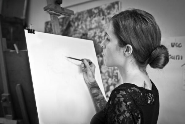
Hey Hey Creatives!
I’ve been asked a lot about my process. The most common question I get is how do I achieve this soft, velvety texture in my drawings? 😉 I’ve been feeling a bit of resistance going into tutorial-style areas. I guess it’s imposter syndrome talking. As if I wasn’t the right person to teach others how to do things. I’m still learning and struggling myself! And there’s this feeling of… shyness, shame? My way is not “correct”. I don’t follow exact steps as I’ve been taught in an academic setting for example. Breaking out the rules gives me a sense of freedom personally (and I think that’s how is appearing the style of Marta? Maybe style is what we do “wrong”:)), but inside I think I still have his fear of being judged by people who know so much more than me. Ugh, lots of work you must still do on yourself, Marta. And the best way to beat inner demons is action. So here I am. It won’t be a super in-depth tutorial, for now, rather I’m going to show you how I approach most of my drawings and what is my thinking behind them. It’s a process that is constantly evolving, as I learn and try different things. Mind you, it is “my” way, not the “right” way by any means 🙂
It’s often not easy to put the process of creating an artwork into words. I guess that as skills grow, and with them confidence, we feel more free to jump around more. Step by step approach dissolves and seems that those aspects that we need to establish and take care of are already in our heads. Everything becomes more habitual, even somewhat automatic. With “Token of Hope” I tried to be a bit more mindful of what I’m actually doing (and finally remembered to make scans during the process), so I could later explain it to you.

1. Let’s start with the concept.
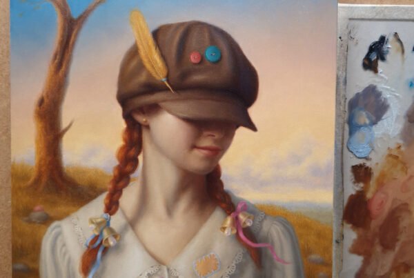
This piece was created for the “Little Big VI” group show at Haven Gallery in New York. The theme open for interpretation for the artist and the only restriction was the size requirements no bigger than 8″x 8”. We got a short description saying “a mini work of art with a big subject matter”.
I always start with the words on paper. Writing was always the main form of expression for me. Usually, I spend more time thinking, investigating the subject, researching, looking for symbolism maybe, and brainstorming ideas… but in this case, I knew immediately what I wanted to do. It’s not often, but sometimes happens and it’s awesome:) You just feel inside and there’s no doubt, no questioning, no temptation to search for another, better idea. Sometimes there are stories we carry within us and they are just waiting for the right moment, for the perfect excuse to materialize themselves.
A while ago I read a story of 1000 cranes. In Japanese tradition, a crane is considered to be a mystical and holly creature cherished by the people. “Bird of Happiness”, a symbol of good luck, peace, healing, and longevity believed to live for thousand years. There is an ancient legend that promises that anyone who creates thousand origami cranes (senbazuru) will be granted a single wish by the gods.
There’s a story of a little girl Sadako who developed Leukemia as an effect of radiation from the atomic bombing of Hiroshima. After learning about the legend she made her goal to fold thousand origami cranes in the hope of recovery from her illness. However, something has changed in her during the process and she decided that to wish for world peace is more important than herself. “I will write “Peace” upon your wings and you will fly all over the world” – those are the words assigned to her. Since then Sadako and her cranes became a symbol of hope and peace for the world. Therefore a little paper crane now carries a big and powerful message. I’ve found my “Little Big”.
2 . Sketches/References
Mainly I’m looking here for a composition. I have a blurry vision in my mind of what I’d like to explore. No details yet, but I know there will be a girl, beautiful, innocent, like a free spirit untouched by the sickness or pain. There must be also an origami crane of course. I’m not sure yet if just a single one or few, dancing around her, I need to see it visually on a page. I’m looking for a sense of lightness, peace, and hope… I’m thinking wind, smoke or clouds which can give an additional sense of etherealness and movement. I’m not able to draw well from my imagination (yet?) so those are rather basic lines and shapes, just to give myself an idea of what the piece might look like and how I’d like to arrange the elements on the page.
I feel like it’s the weakest part of my process. Pre-production and sketching are pretty new for me. I’ve learned to draw by observing objects around me. During my time in the atelier, the cast or the model was just there, in front of me. I had to only draw it as accurately as I could. We never talked about composition or other aspects of picture-making, so now I’m trying to practice a lot those aspects. Hope that next time I will show you more of a sketching part:) and freedom in it.
I am an obsessive reference collector 😀 I have a board on Pinterest literally for everything. Those mostly are not copyright-free, so we need to be careful and treat them more like inspiration. For copyright-free images, I go to places like Shutterstock (paid) Unsplash (free) for example or buy from artists like Howard Lyon and studios like Grafit. I often take also photos of myself, mostly hands to see how anatomy works.
I’m searching for a similar position I’ve created in my rough sketches. This step opens new possibilities and I welcome them as they come. I’m very visual and very often when I look at photos I see a different opportunity it offers that I haven’t thought of before.
3. Materials I use

- Strathmore Bristol 400 series – I tried many may papers and the search for this “perfect” one never ends:) but this one is pretty close for me! I love smooth, soft surfaces, yet with a slight tooth which allows to build up more than just one layer, as often happen with super smooth and slicky bristols.
- Staedtler pencils Mars Luminograph – I just love wooden, old schol pencils. I love how they smell and feel in my hand. It’s just a personal preference, eferything I’m doing can be achieved with mechanical pencils as well. Look for tools that feel right to you:)
- knife for sharpening – I just love to work with long, sharp point 🙂 It helps me to maintain light hand and saves time on constant sharpening
- fine grain sandpaper
- Kneaded eraser
- Tombow Mono Zero eraser – perfect for details. You can cut it and sand it to even smaller point. Works great with hair, fur, feathers etc
- fixative
- lots of coffee and good audiobook/podcast to listen to 🙂
4. Drawing, aka block-in
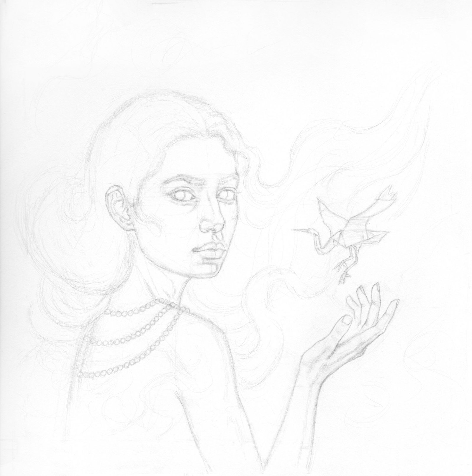
With each step, I tend to wear different hats. While blocking-in the drawing I don’t think much of volume at this point but rather enter more abstract mode. I mostly think about distances between lines, their angles with each other, shapes they create.
I start with rather ghostly, light, and thicker lines, just using observation (sometimes the eye itself is so much more accurate with judging proportions than jumping in with measurements from the very beginning).
Later on the top I refine everything being more and more exact and erase old lines as I go. It’s the moment for checking my previous efforts and start measuring. There are many accuracy techniques I use at this point. My three favorites are – vertical and horizontal alignments, implied lines, and triangulation. I’m thinking to make a whole separate post about this 🙂
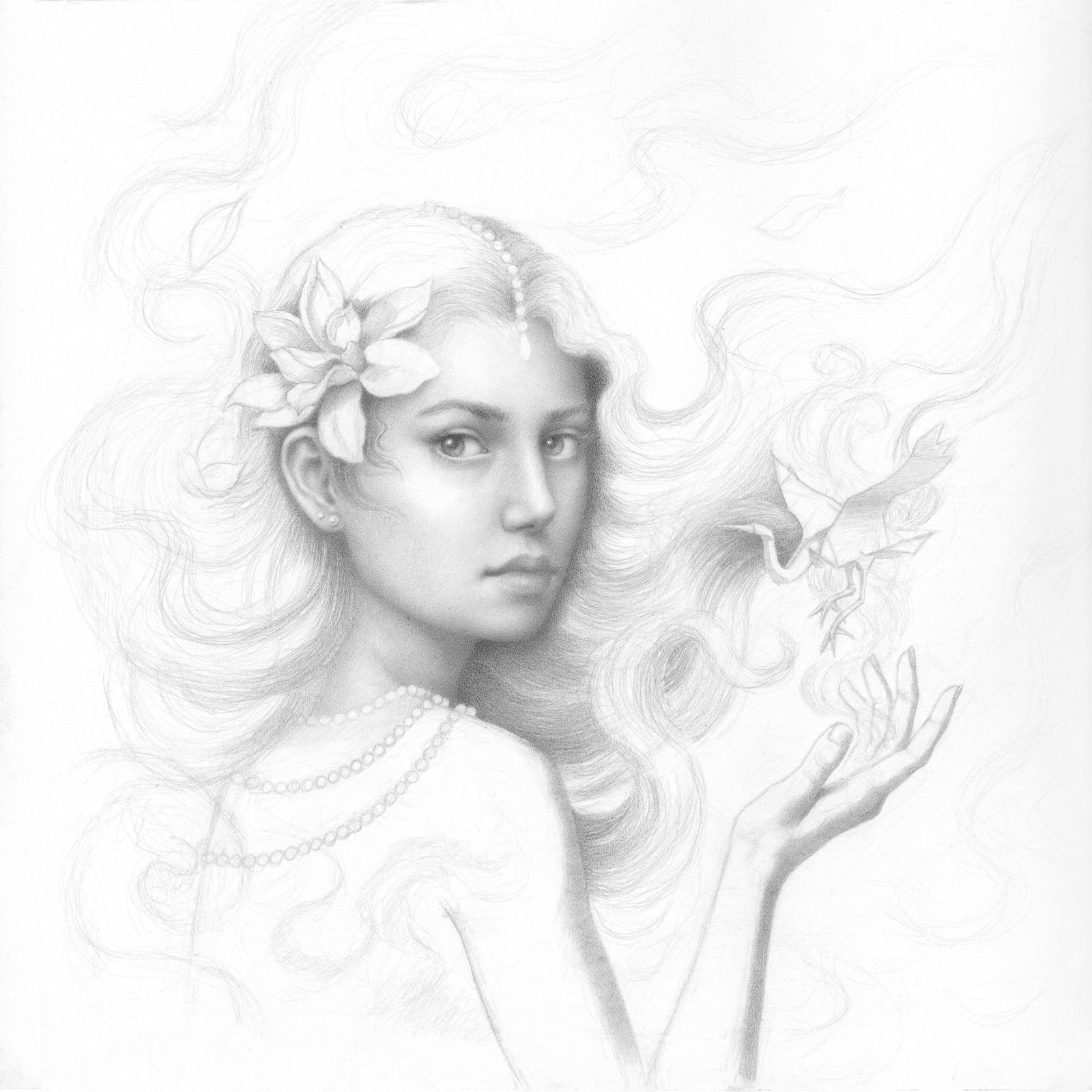
5. Establishing shadow shapes and refining the drawing at the same time.

I set my light source on the top left corner. From now on every single element in my composition must be consequently lit and affected like that. My intention is to create rather a low-key drawing, without hard, sharp shadows. So in this case the shadow areas are rather thin, yet visible enough to describe well the turning form.
I find that when there are only lines done it’s hard to accurately judge all distances and placements. That’s why at the moment when I feel pretty satisfied with the line drawing I fill in the shadows lightly, not with accurate value yet. I build up slowly, correcting my drawing as I go. Shapes created by shadows are much easier to judge. You clearly can see if something is too big, too small.
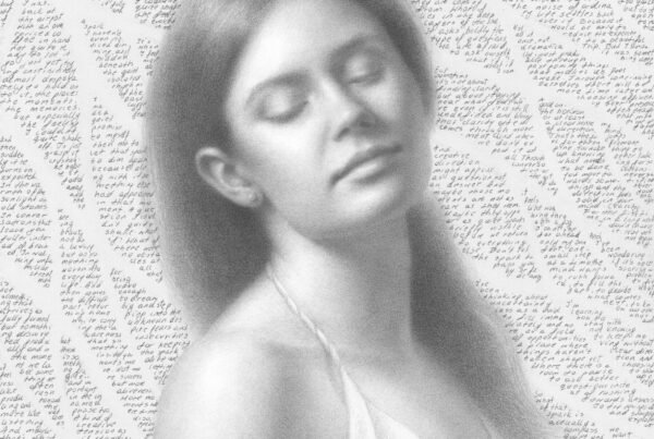
Oh, I also felt like she needs something in her hair, this area was too empty. Now the flower counterbalance with the crane feels more balanced.
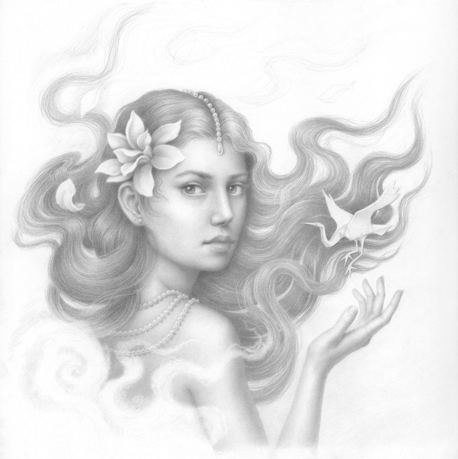
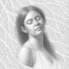
6. Once shadow shapes are established I dive into my favorite part – rendering.

In pieces like that, when there’s only one character with the focal point on the face, I usually (ok, ok always) start with the eyes. I want them to be haunting and soul-piercing. They set a tone and level I want to achieve for the rest of the piece. As you can see I work part by part, trying to push and finish each one as I go. Here you can see that taking the head, for example, I’m darkening parts around the face, to establish the tone and contrast I want. I need to establish my darkest darks and lightest lights to create a value range that will become my reference. The darkest area is right below her chin and the upper part of her head where the hair meets the forehead and falls on the side. Those are areas where the light almost can’t reach at all. The lightest part is on her forehead, where the light hits directly. I leave the white of the paper there.
I also attempt to figure out what would be the value of the hair and how it would interact with the face. I tend to decide as I go, based on the elements I already have done. I only know that I want her hair to be dark against the lighter background.
P.s. Value studies surely would be helpful during the preproduction part. Either done traditionally on paper or digitally, so I wouldn’t have to figure it out during the process ( I like it tho in my personal projects when I don’t need to rush anywhere). Ahhh, damn Photoshop, haunting me for years now. Need to learn it. Eventually.
7. Time to figure out the hair


It’s like a puzzle to me. With fur, feathers, or hair I think on the paper as I go, discovering different ways and patterns. When I feel stuck I search for more references. I look at both photographs, to observe how the real hair behaves and also at illustrations that I like, where hair is already stylized and designed to give myself an idea, learn its “language” and take what I like.
As I already mentioned my intention is to push each part to the finish as much as I can ( I rarely go back), so when I meet the flower, pearls, or the crane on my way, I then try out and decide how those elements would interact with the hair. I knew that I want them to be white, but again, the little value shifts and changes are tuned to those that I already have. It’s like composing a piece of music, one note sets the tone for the following one, so they both sound harmonious.
8. Hand and crane.
I approach the hand in the same way as all elements above. I’m comparing values around as I go, thinking about the light and how it behaves on each form.
When rendering, it’s very helpful to think about the planes of an object. They can be broad like front, side, back etc but you really can divide them into smaller and smaller pieces to the point they become like pixels. Each plane, even the smallest one has a slightly different inclination to the light source, therefore its value changes. Not only inclination but the distance too. The further it is from the light source, the darker it will get. I think of those concepts always as I render.
9. Smoke (or clouds? or mist? hmm)
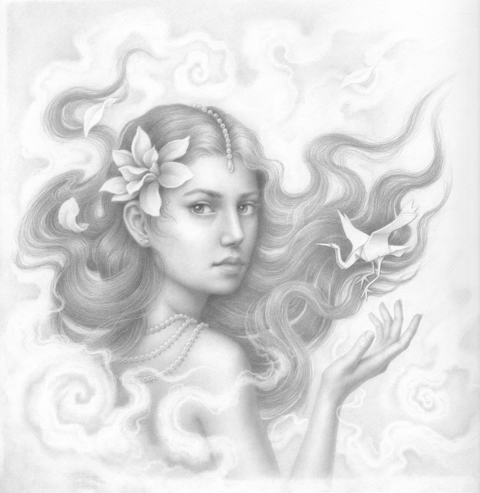
My approach is exactly the same as in the case of hair. Those are moments when I feel the most free and playful. I treat it like a puzzle game, adding, taking, sharpening, or diffusing. I think purely in composition at this point. What feels right? What serves my overall drawing and what doesn’t? I don’t remember exactly from which artist I heard it, but he said that composition is right, when it feels right:) I find it very true.
10. Last details, checking it in frame

I’m not completely happy with this frame. Reddish patterns distract my eye a bit from the piece. But it’s what I got (I ordered from an online framer, it looked more “quiet” on the photo) and I didn’t have time to change it before the shipping deadline. Usually, I tend to choose black, but this time I was going for something lighter, something that would not overwhelm the delicate piece but rather add to its subtlety. I feel like framing the piece is another form of art, or maybe rather still part of this creative process. A good frame can add or take from the overall visual experience. Always learning and improving:)
I forgot the last thing. How do I achieve this smooth, velvety texture? You all came here just for it right? ;D I think that the answer might be disappointing. It’s just patience! I render each area with very, I mean very sharp point of the pencil, so it fills in most of the visible pores in the paper. I don’t smudge, I don’t blend. I find that when I intend to, I lose control fast. I saw artists using blending sticks or brushes with excellence! So it is of course possible. My attempts finish rather looking dirty, so I stay with my way:)
That’s it for now:) I hope you’ve found it useful! I will be trying to get more and more in-depth in the future as it’s just impossible to contain all the information just in one post. I’d love to hear your thoughts in the comments. Is there something specific that you’d like me to touch upon next time?
P.s. I really enjoyed working on this one, it made me feel really peaceful. I’m so happy to share that it got sold during the show!! woop wooop!!! 🙂
Recent Comments